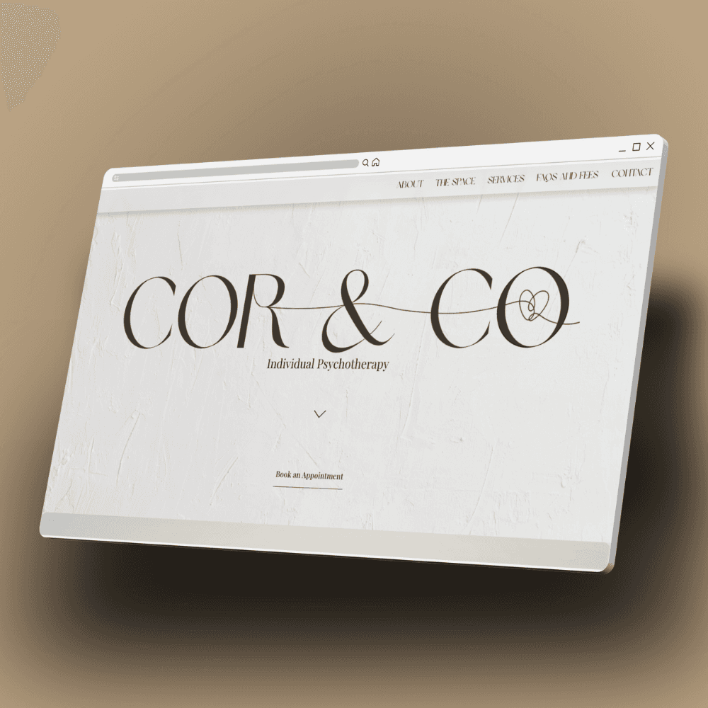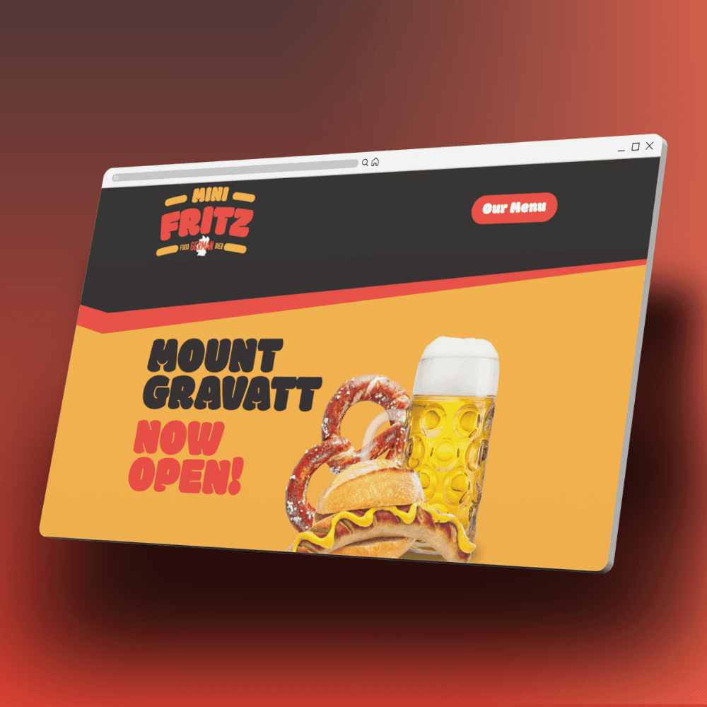
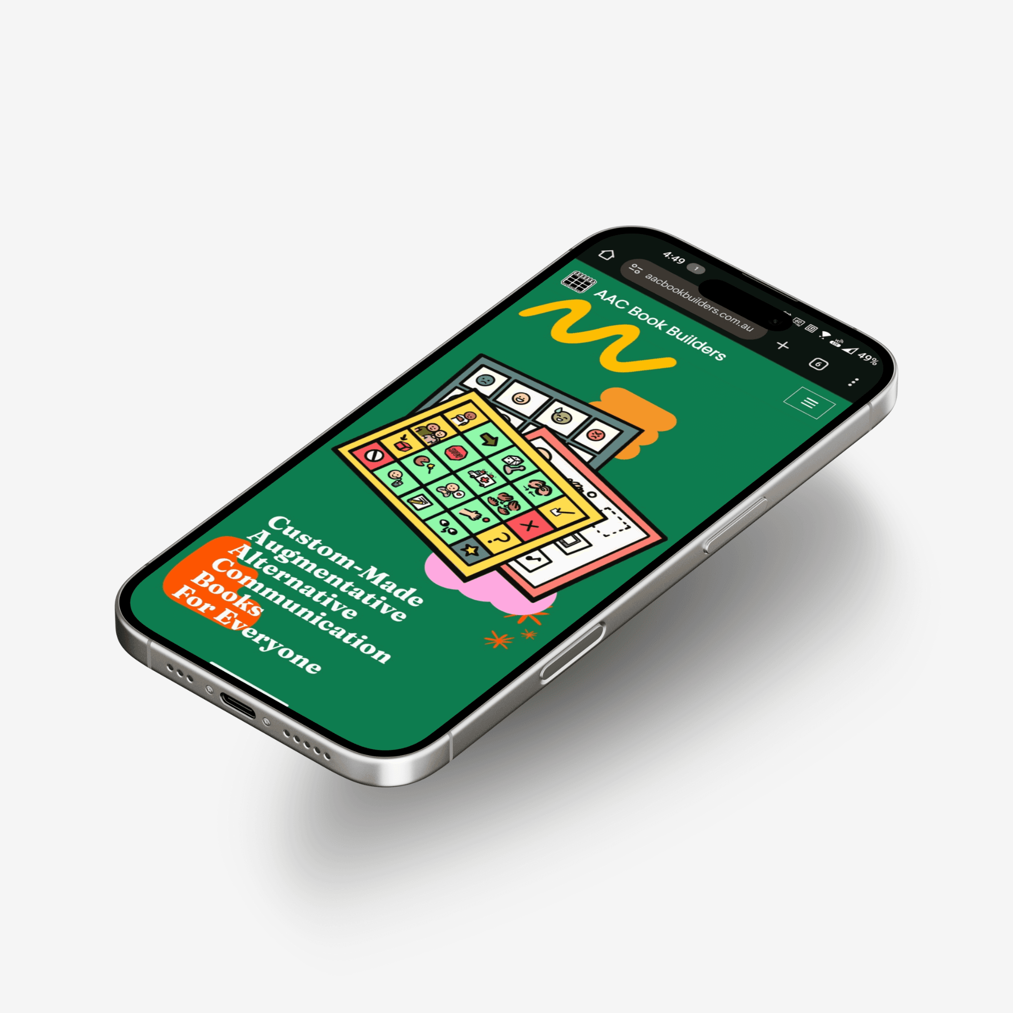
Above the fold, a bold headline is paired with a prominent accent-coloured CTA button that immediately drives action.
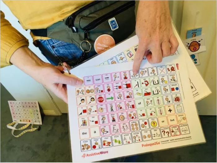
Consistent sans-serif typography, ample whitespace, and subtle hover effects throughout create a professional yet welcoming aesthetic that mirrors AAC Book Builders’ mission to empower communication for all.

High-contrast colour palettes ensure text and interactive elements stand out clearly against their backgrounds, improving readability for users with low vision or color deficiencies.
Meeting WCAG contrast ratio standards not only enhances usability but also reflects a commitment to inclusive, accessible design.


"Nathan broke down the steps of design, user experience and access to build a website to suit my business needs, with style and flair."
"I know nothing of building a website but had a need for my new business. Nathan broke down the steps of design, user experience and access to build a website to suit my business needs, with style and flair. He is open to my suggestions and quick to include adjustments to manage the website. It is really great to draw on his experience and knowledge. I am very pleased with the new website." Julie, AAC Book Builders